Saturday, July 31, 2010
Believe in your dreams
The July Challenge for Paperbag Studios is flowers. All stamps I used are from Paperbag Studios. I began by cutting some heavy chipboard using the Sizzix Alterations Tim Holtz Ornamental die. I stamped the script image twice along the right side with Versamark Ink and embossed it with clear powder. Distress Inks broken china, mustard seed, and wild honey were added to the chipboard using a blending tool and foam... flicked some water onto the chipboard, let it sit just a bit, blotted it up and dried it with a heat tool. The single flower was stamped onto the chipboard with Adirondack snowcap pigment ink. The girl was stamped onto a scrap of white cardstock with Archival Ink jet black and colored with Distress Inks tumbled glass and mustard seed... I then used a wet paintbrush over the face area, blotted it and dried it to lighten it up. Chalks were used to add the pink color to the lips and cheeks. I tore the image out and layered it to a scrap of text paper colored with Distress Ink antique linen. Glaze pen was used to color the flower and a sticky back gem added to the center. "Believe in your dreams" was stamped on a scrap that I tore from around the girl and cut out. Flowers punched from scrap cardstock, colored with Distress Ink broken china and then Glaze pen. Lace, images, and flowers were added as shown. "Stitching" added with the Inkssential white pen.
Saturday, July 24, 2010
Created Byhand Challenge
This weeks Created Byhand Challenge (forum or blog) is Looking In...Looking Out or Use Dies. My atc uses a Spellbinders circle die. I cut the circle out of a piece of shiny white cardboard like you'd find in a shirt package or something like that. We got a whole box of the cardboard at a garage sale for a couple of dollars. After the circle was cut I layed it on a kraft ATC blank and then trimmed the sides off to fit the atc. The atc blank is colored with Distress Ink Victorian Velvet (love this color) with a little brushed corduroy around the edges. On the trimmed circle I stamped the small butterfly with Ranger's resist ink, let it dry a minute and then using a blending tool rubbed on Distress Ink wild honey and victorian velvet... buffed off the extra ink with a napkin and then edged the piece with brushed corduroy. Stamped the quote with Archival Ink jet black. Stamped a small butterfly on a scrap of white cardstock using victorian velvet, cut it out, and added sticky back pearls to the body. Also added pearls to the corners of the atc.
CCC #6 - Multi Medium Collage
It's hard to believe that the Compendium of Curiosities challenge is 6 weeks old already. Check out Linda's blog for all the details. This weeks challenge is page 66 of the book... Multi-Medium Collage. I worked the technique on Ideology Stencil Type Letters. All stamps used on this tag are Tim Holtz. Alterations flourish die cut from grungepaper. Distress Inks used are tumbled glass, stormy sky, dusty concord, crushed olive, and milled lavender. Purple glaze pen as highlights over the stamping done with dusty concord (in some spots the light caught it and made it look silver in the picture) and also for the dots inside the letters. Silver paint dabber on the edges of the tag and added lightly with my finger here and there on the flourish. Glittery sticky back gems along the bottom on the piece cut with the On-The-Edge die. Ideology flowers to finish it off.
Sunday, July 18, 2010
CCC #5 - Distress Powder
Linda's challenge this week for Compendium of Curiosities is found on page 43 of the book. I love the Distress Embossing Powders the first time I ever used them because I am definitely a texture girl!!!
Supplies used on my tag are....
Distress Embossing Powder - Scattered Straw (background), Walnut Stain (on the scrollwork)
Distress Inks - Dusty Concord (under the straw ep), Rusty Hinge, Barn Door, Mustard Seed, Antique Linen, Pumice Stone, Black Soot
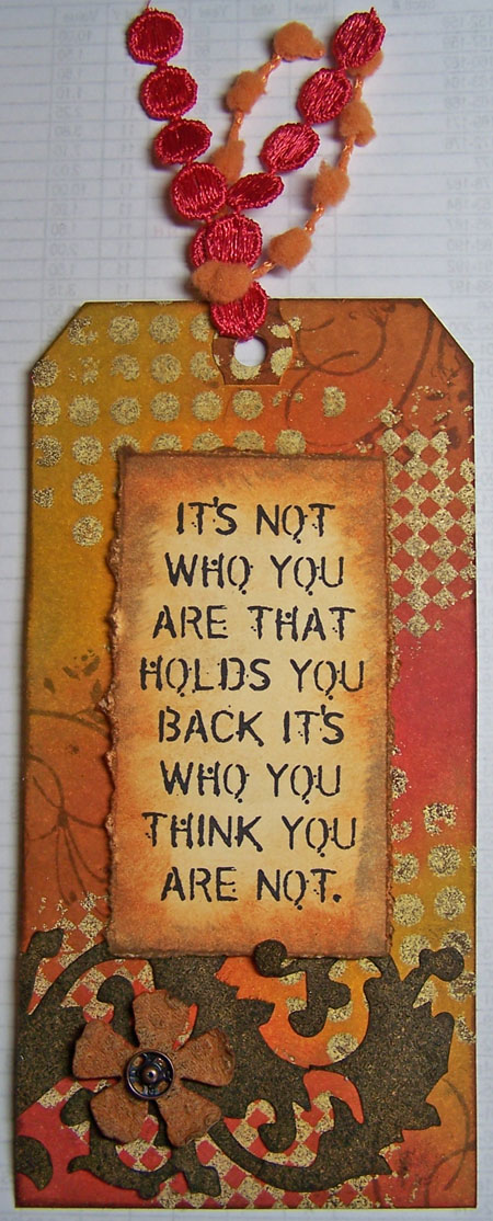
Alteration Dies - Tattered Florals, Scrollwork
Ideology - Snap
All Tim Holtz Stamps
Making Memories trim
Tuesday, July 13, 2010
Created Byhand Challenge - Stars
The theme this week on the Created Byhand Challenge (forum or blog) is either Freedom or Stars - I went with stars. This is a large card - 6 1/4" square. On a 6" square piece cut from a manila folder I sponge various Distress Inks. Using a brush with not too much water on it I speckled on some water drops (I didn't do my usual flick off the fingers because I didn't want any large water spots). Across the bottom is stamped some fiddleheads (Quietfire Design) with Archival Ink jet black. All the white dots are made using the Ranger Inkssential white pen (I totally love this pen). Stamped the saying (Quietfire Design) on white cardstock, cut it out with Spellbinders Classic Scallop Rectangle next to the largest die and with the die still in place used the foam blending tool to sponge on some Distress Ink milled lavender and dusty concord. Colored white silk ribbon (Quietfire Design) with dusty concord ink. A star charm wired in the bow to finish it off. Quietfire Design has some nice star charms but I must have used them all up - need to restock :-)) I have no idea where the one I did use on the card came from.
Monday, July 12, 2010
Sunday Stampers - Song Sung Blue
I've had a good time lately just throwing things together :-)) Sometimes it does feels like that!! and it's always exciting when it turns out great... some are only ok. It's much better than planning for me because if I plan a project and try to stick to my plan, it's always a disaster... it just won't come out right. I always try to check out Hels' blog Ink on My Fingers and she also runs a challenge called Sunday Stampers and I had seen this weeks theme and had thought... just maybe I could participate this week, maybe. So yesterday I was just putzin' around wanting to make something and not feeling very inspired... there are a couple of things I SHOULD be working on but just couldn't seem to get there so I was sorting out some stuff as I'm still trying to get everything moved, cleaned and sorted into my new Studio area and I came across a piece of copy paper I had saved because I thought I might just wanna use it someday. Quietfire Design sells some really nice white silk ribbon and you can use it white OR you can color it... oh ya!!! If I color it with Distress Ink (which I like to do) I then run it inside a folded piece of copy paper through a cool little tool called a Ribbon Iron from Pebbles Inc. This dries the ribbon nice and flat (I use the paper so I don't get extra color on the inside of the iron)... now if you want wrinkles, just wad it up and use your heat tool (forget the paper). So this piece of paper I had found had lines of color on it from doing what I just explain and I'm pretty sure the color I had used was Faded Jeans.... and I immediately knew I wanted to use it just then. I wadded up the paper a couple of times and layed it back out.. not too flat.. and gently ran tumbled glass Distress Ink over it with the blending foam catching the high spots.. not pushing hard enough for the low :-)) Stuck it to an atc blank and cut off the extra paper. Now what to do... well, I did have that song popping into my head (Thanks, Hels) and Tim's tissue tape sitting right there so next went on a piece of the music tissue tape, then edged the whole piece with faded jeans ink. Decided I felt like using a grungeboard heart and got one out... inked it with dusty concord, spritzed water on it so the whole top was wet, let it sit a couple of seconds and blotted it off... then I took the tumbled glass foam again and caught the high spots.... set it on the atc and thought "now what am I going to do"... looked up the lyrics for the song and found some I wanted to use, printed them out, cut them out, edged them with tumbled glass and added them to the heart. Now what??? I looked at my music stamps and found an old Stampin' Up image and stamped it on the right like it was flowing from the heart. Then decided to add a flower of some sort and chose Ideaology (good choice) I used two flowers plus the brad for the center. To color the brad I heated the head, while hot I dipped it in Broken China Distress Embossing Powder, melted the powder and repeated 2 more times (love doing this!!) To finish off the ATC I added black dots along the top and bottom using Enamel Accents.
Simon Says Stamp

Simon Says Stamp is having a
Humungo Christmas In July Giveaway!
zoom on over to their blog for all the details.
Sunday, July 11, 2010
Hot, Hot, Hot
This weeks Created Byhand Challenge either on the blog or the forum is Hot, Hot, Hot or you could just use the color Yellow. For Hot my mind went to bright, hot colors and I used a piece of Doodlebug flocked paper in a very bright pink for the background of this atc. The collage image and "heart" rubber stamp are both from Quietfire Design. I cut out the collage image and added gold Paint Dabber around the edges of the image and the edges of the background. I also colored a scrap piece of screen (it came from the edge of the roll where the wires are looped back) with the gold Dabber. A piece of white silk ribbon (also available from Quietfire) is on top of the screen. The wire and beads nest I did quite some time ago and hadn't yet used it on anything.... to add to it I punched 2 flowers from old music paper, colored them with Distress Ink antique linen, scrunched them up and used them under the wire nest. "heart" is stamped on an edge of the old music paper, torn out, and sponged around the edges with antique linen.
Saturday, July 10, 2010
Foam flowers on a Chipboard Hanging
I'm not sure how this is going to look on your screen. I could not get the colors to be right on my screen... purple and blue together just seems to be really hard. Anyway I'll tell you what I used and hopefully you'll be able to see it in your mind the correct way. I had a friend over this past week and we were working on getting some things ready for a craft night with the kids at church on Wednesday. After we had everything ready we were looking ahead at 2 other craft nights there will be during the summer. For one of them we are going to make pencil toppers and we were looking at foam sheets and dies and I showed her how some of my dies would cut the foam just fine so we have some ideas and will work on it another week. After she left I had these foam flowers laying there that were cut with Tim Holtz's tatttered florals die out of a light green foam and the urge to stamp into foam was too strong, lol. So I heated the flowers and pressed them with Wendy Vecchi's dotted background stamp (all stamps used in this project are Wendy Vechhi Studio 490 stamps). Then I painted them with Ranger's paint dabbers in purple twilight and pool. The large flower is the purple and the smaller one the blue. After the paint was dry I used my finger to lightly add snow cap paint over the top which left the paint down in the dots a deeper color than the top. So I had these two flowers laying there... why not use them. Out came a page from a Maya Road chipboard book. I colored it with Distress Ink bundled sage, waterstamped the screen image on it and added brushed corduroy around the edges... then also stamped the speckled background image on it with Archival Ink olive... Decided I needed leaves with my flowers so stamped them twice on grungepaper with Archival Ink olive, cut them out, added shabby shutters and dabbed a little peeled paint here and there. Checked placement of the leaves and flowers, stamped the saying, stitches, and flourished with Archival Ink jet black. Adhered everything to the tag as shown glueing small pieces of grungeboard scrap between the flowers and the Ideology token on the top. Also very lightly added some snow cap paint to the token with my finger. Decided I needed something else and stamped the butterfly on grungepaper, cut it out, sponged on broken china and just a touch of dusty concord and finished up with Adirondack purple twilight. Added dots to the body with the Inkssential white pen. Went over the dots on the flourished with a black Glaze pen. Copper wire for the butterfly's antenna and the hanger.
Monday, July 5, 2010
Another Birthday Card
Well the center of this card just sort of happened. Along the left is a piece of Tim Holtz tissue tape that I had cut off a roll to get to the area I wanted to use on a different project and so I didn't want what I cut off to go to waste and had to put it on something and the atc sized background was just laying there and it even looked good on it so that's where it went. Then I had some metal elements I had received from Croppinsville Studio laying there and the pieces I put together to make this flower (stem/leaves, flower, flower center) looked really good sitting on the atc so I used alcohol inks to color the pieces to match. To put the metal pieces together I took a long brad, heated the brad part and dipped it into Distress Embossing Powder mustard seed, melted the powder, redipped and melted again. I love the texture of that embossing powder on the brad for the center of a flower... it looks so realistic!!! All the layers on the card are edged with Distress Ink tea dye. The layer under the atc sized layer is a piece cut from an old manila folder sponged with Distress Ink victorian velvet and bundled sage. The leaf background (Studio 490) is stamped over it with Archival Ink olive... I did not ink the stamp well as I didn't want a bold stamping. The bottom is cut with a Tim Holtz On the Edge die. The next layer is again a piece cut from the manila folder sponged with antique linen ink and stamped with a speckled background (Studio 490) using tea dye ink. The folded card is a light kind of dusty green color sponged with bundled sage. Stamped "Happy Birthday" (Hero Arts) onto a scrap of the manila folder, punched it out, sponged with victorian velvet and lightly stamped the leafy background on it with victorian velvet. Next circle is sponged with bundled sage. Both circles are edged with tea dye.
CCC #4 - Shabby Chic
Lots more fun with the Compendium of Curiosities Challenge this week and amazingly enough I'm getting it done on the first day instead of the last. My "tag" is made with grungeboard and I used an "On The Edge" die to cut the bottom. Paint dabbers used for the technique are espresso and snow white. Over the background technique I also stamped some circle/spatter images using paint dabbers. All stamps are Tim Holtz images. The Mona image and quote are stamped onto a manila tag, colored with Distress Inks, cut or torn out and edged with paint dabbers. Inkssential white pen to color "creativity" and "art" and also for the dots at the top and bottom. A pen nib colored with alcohol ink butterscotch, twill ribbon, and a trinket pin finish things off.
Created Byhand Challenge - Red the New Black
Last weeks Created Byhand Challenge is Red the New Black... now the new challenge has been posted a day early but that's ok, I'm still sharing my atc. I started with white cardstock, sponged it with Distress Ink barn door using the blending tool and foam. Embossed it using the Tim Holtz regal flourishes folder. Used my finger to rub metallic rubons over the embossing. "Flourish & Grow", a Quietfire Design stamp, is stamped onto vellum using Archival Ink jet black, tore the vellum at the top and bottom, dabbed the torn edges with gold paint, and folded it around the atc taping the edges to the back. Distress Ink fired brick sponged on the edges of the ATC. Tim Holtz dies - flourish and flowers - are cut from grungepaper. The flourish is colored with Distress Ink fired brick and then Distress Stickles fired brick are added on top. The flowers are colored with gold paint and music image (Quietfire Design) is stamped on with Archival Ink crimson. Dew drops added to the centers of the flowers and 3 red flower brads added on the right.
Sunday, July 4, 2010
ATC
This atc is inspired by a page in Somerset Studio Gallery Summer 2010. I was looking at the magazine this past week and when I saw some atcs made with screen I knew I had to try it. The artist in the magazine is Nathalie Thompson and I just found her blog here. So the base of this atc is only screen, no paper or chipboard or matboard or anything but the screen. After cutting the piece of screen (I used Tim Holtz tonic scissors) I painted it with Paint Dabbers )brown, blue and green)... let it dry and then painted it again to get deeper color. The collage image and "cherish" rubber stamp are from Quietfire Design. I've used lace, a metal label holder (I just can't think of the actual name), decorative brads, silk flowers, and some craft wire there in the upper right corner. I really enjoyed making this atc and I think I'll do a group of them for an in-person swap I'm attending at the end of this month.
A Birthday Card
The flowers are a Hero Arts stamp. I stamp it on white cardstock with clear ink and embossed it with clear embossing powder... color is added first with Stamp Zia sprays, dried it, then sponged on just a little Vivid ink for some darker areas... cut the piece out with deckle scissors and layered it to white cardstock and once again cut with deckle scissors. Stamped "Happy Birthday" onto white cardstock with Vivid spring green ink, cut it out, edged it with gold Paint Dabber and sponged a little ink over the word. The orange layer is orange cardstock embossed using the Tim Holtz embossing folder rays and then very lightly rubbed the gold paint dabber over the embossing and also dabbed it on the edges. The green layer is green cardstock stamped with a crackle image... I stamped it several times, then re-inked and stamped it several more times, etc. The butterflies are punched from cardstock and then colored using the gold paint dabber pressing it so it left texture rather than rubbing it on. Sticky back gems added to the bodies.
Compendium of Curiosities #3 - Alcohol Ink Monoprint
This weeks CCC (that would be Compendium of Curiosities Challenge) is Alcohol Ink Monoprints... a technique that I have done before and really enjoy!!! You could easily spend a half hour and have a PILE of prints to use at a later time... fun, fun, fun!!!! The alcohol ink colors I used on this piece are raspberry, sail boat blue, and purple twilight... they sure make a gorgeous print. All stamping done on top of the alcohol inks is with Archival Ink... I used to use Staz-on before I got my jet black Archival pad and let me tell ya... Archival Ink works WAY better for stamping on the alcohol inks!!! All stamps used on this tag are Tim Holtz. For the tag base I applied Distress Ink mustard seed to the tag, stamped the swirly flower image with Versamark Ink and embossed it with Adirondack wild plum embossing powder. The bird is stamped onto grungeboard with Archival ink jet black, cut out, and then sponged with DI mustard seed. Added the paper flowers (some sprayed with Adirondack color wash spray and some sponged with Distress Inks) and clear sticky back gems for the centers of the flowers and also the eye of the bird. Oh, silver paint dabber added on the edges of the monoprint piece and the edges of the tag. A pretty pink ribbon to finish it off.
Wednesday, June 30, 2010
Two Cards
Both of our boys are at camp this week. This is the first year they've both been gone at the same time... talk about quiet!!! These are the cards I made to mail to them.
I sent this first one to Tim (13 years old). He loves animals and actually likes the color pink. The giraffe image is an old one from Embossing Arts and the scripture is a Stampabilities image. Stamping was done with Archival ink jet black. Colored the giraffe using a Dove Blending pen and Tombow markers. Distress ink on the edges. Tim Holtz embossing folder burlap in the back... also some Distress ink there to bring out the embossing more. Black Glaze pen for the dots.
This card is for Nick (16 years old). He loves music!! All stamps are from Our Daily Bread Designs. Background is old sheet music made to look even older with edge distressing and Distress Inks. Stamping done with Archival ink jet black. Bird/flowers colored using a Dove Blending pen and Tombow markers and then cut out with just a small border.
Saturday, June 26, 2010
Compendium of Curiosities Challenge #2
The CCC week #2 Challenge is Fragments Basics. All stamps used on this tag are Tim Holtz. I stamped the saying with Archival ink jet black onto a piece of Tim Holtz paper from the Lost and Found stack and added my fragment over it. After it was dried and trimmed I dabber around the edges with gold paint dabber but then decided white would be better and went back over it... you can see some gold peeking through the white which is very cool. For the tag I stamped the flourish image with white paint dabber, dried it and then added Distress Inks spun sugar, crushed olive, and victorian velvet. Next is a piece of Tim's tissue tape (from the nostalgic pack) down the right side... I only put about half the tape on the front and then folded it to the back. Added some pumice stone ink around all the edges. The large flower is grungepaper cut with Tim's tattered florals die, colored with victorian velvet... then stamped a "speckle" image over the flower with white paint dabber and also touched the dabber on the edges of the petals. I also cut little slits between the petals so I could give them more shape. Silk leaves under the flower and a peach colored silk flower in the center. The small flowers down the right side are punched from white cardstock colored with victorian velvet. Again I added a little white paint dabber to the tips of the petals, attached them with Glossy Accents and added a white sticky back pearl to each center. Fibers added to the top, white wire holds them together and also is used to attach the Ideology piece which I used my finger to gently rub white paint dabber over the letters to bring them out.
Created Byhand Challenge - Songs we Sing
This weeks theme over at the Created Byhand Challenge Blog is Songs we Sing. I love this song stamp from Quietfire Design and had to use it along with the bird, flourish, and music images. This is a #8 size tag. I glued a torn piece of old music paper across the center and then colored the whole tag with Distress inks wild honey and barn door using a blending tool and foam. Above and below the music paper I stamped QFs music stamp using water. Stamped the bird at the top and the flourish around the edges using Archival Ink jet black. Next I distressed the edges of the tag using the Tonic distresser tool and then added some vintage photo ink on the edges. The calligraphy image is stamped on white cardstock, cut out, colored with Distress ink scattered straw and the edges with vintage photo. Thin brown rickrack is wrapped around the tag and tied in a bow. The large black music note is a decorative button with the shank cut off and I rubbed some matte accents on it so it wasn't so shiny. Lastly I added some gold dots with Smooch, gave the bird an eye and also colored the inside of the letters with it.
Happy Birthday Card
I made this birthday card for my step-daughter but I also made the background with gg designs current challenge in mind.... which is plastic wrap. All stamps used on this card are from gg designs. For the background I used Ecoline inks and Perfect Pearls and when dry stamped the flower image. The central image is stamped on white cardstock with Archival ink jet black and colored using Tombow markers and a Dove Blending pen. The the ovals with Spellbinder dies. Silver paint dabber was used on the edges of the background layer and the blue oval. White stitching and dots done with the Inkssential white pen. Paper flowers and sticky back gems to finish.
Sunday, June 20, 2010
Compendium of Curiosities Challenge #1
Over on Studio L3's blog a series of challenges has begun. Every Monday Linda will post the page and name of a technique that is found in Tim Holtz's newest book Compendium of Curiosities and she invites anyone who would like to work their way through these techniques to give that weeks challenge a try and share their results. This first challenge is Water Stamping and I made a tag. Distress inks used for the background are forest moss and broken china. Water stamping done with a stamp from the Fancy Flourish set. The words (also Fancy Flourish set) are stamped with Archival Ink jet black. The flowers at the top are cut using Tim's tattered floral die out of the plastic packaging that his texture fades embossing folders come in. Color was added using alcohol inks. They were embossed using the Damask folder. Gold mixitive was gently rubbed over the top of the embossing using my finger. The bottom of the tag is cut using the ornate on-the-edge die and then I added a piece of tag behind the cut area that was colored with both distress inks and adirondack ink so that the color would match the flower. A gold butterfly charm with the edges of the wings alcohol inked. Gold sticky-back pearls added to the center of the flower and along the bottom.
Friday, June 18, 2010
Twinchies
If you don't know what a twinchie is... it is art on a 2 inch square. Recently there was a twinchie swap on the EverythingWendyVecchi yahoo group that I participated in. These are the twinchies I made for the swap... we were allowed to go "outside" the 2 inch square so I did. The base is grungeboard. I used Distress inks for coloring and Archival inks for stamping. All Studio 490 stamps. Distress stickles on the flowers after coloring and stamping. An Ideology snap and memo pin.
Sunday, June 6, 2010
A new stamp from Quietfire Design

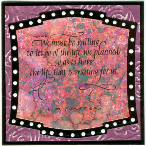
Quietfire Design has two new calligraphy images... you can see them both here and they are both on sale until June 9th... info here. I'm using one on this little card that measures 4 1/4" square. All of QF's calligraphy rubber stamps are made from Suzanne's beautiful hand-penned calligraphy. The quote is stamped with Versafine ink and embossed with clear detail embossing powder onto a piece of background done with alcohol inks. My daughter and her friend were over a couple of months ago and we spent some time just playing with alcohol inks. I can't tell you exactly which colors I used on here but I can tell you that I made a lot of the speckles by putting alcohol ink on an old toothbrush and running my thumb over it. The big light areas were made by shaking on some blending solution, letting it sit a few seconds, and then blotting up the excess. After stamping the quote on it I cut it out with Spellbinders Labels Two die next to the largest size. It is mounted on a layer of black glossy cardstock cut with the largest size die. The next layer is a piece of white core cardstock embossed with a new Tim Holtz texture fade embossing folder - regal flourishes - and then I sanded over it with the Tim Holtz sanding tool. The base is again black glossy cardstock. The white dots are made using Ranger's new accent enamel... very cool stuff.
Mini Banner Swap
There was a mini banner swap on the EverythingWendyVecchi yahoo group last month that I participated in. The banners are 3 1/2" wide and 5" long. These are the 6 awesome banners I received back in the swap. They are from Lori, Debby, Kim, Kathy, Nancy, and Alexandra.
These are the banners I made for the swap.
And a closer look. I worked on Sticky-back canvas. I cut the canvas to size, stuck it to a piece of the new Tim Holtz paper, cut the paper and then frayed the side edges of the canvas. The background started with Wendy Vecchi's pigment and pearls technique - if I remember right, lol - I used Adirondack pigment ink terra cotta and gold perfect pearls. Then I stamped the leafy background image over it probably with terra cotta ink, next the words with Achival Ink jet black and then the floral border image with watermelon pigment ink. The bird is cut from grungeboard using Tim Holtz's alteration die and colored with distress ink with a little pigment snow cap dabbed along the belly area. The wing was stamped with a background image. A black gem for the eye. The flowers are cut from grungepaper also using an Alterations die, colored with distress inks and stamped with Archival inks, larger black gems for the centers.
These are the banners I made for the swap.
And a closer look. I worked on Sticky-back canvas. I cut the canvas to size, stuck it to a piece of the new Tim Holtz paper, cut the paper and then frayed the side edges of the canvas. The background started with Wendy Vecchi's pigment and pearls technique - if I remember right, lol - I used Adirondack pigment ink terra cotta and gold perfect pearls. Then I stamped the leafy background image over it probably with terra cotta ink, next the words with Achival Ink jet black and then the floral border image with watermelon pigment ink. The bird is cut from grungeboard using Tim Holtz's alteration die and colored with distress ink with a little pigment snow cap dabbed along the belly area. The wing was stamped with a background image. A black gem for the eye. The flowers are cut from grungepaper also using an Alterations die, colored with distress inks and stamped with Archival inks, larger black gems for the centers. Saturday, May 8, 2010
Wendy Vecchi Classes
Last weekend Wendy Vecchi came to Memory Bound store in Ankeny, Iowa and I was able to take 2 of her classes. I had an absolutely fabulous time!!! This is a picture of me and Wendy.

This is a picture of Wendy near the beginning of the first class.

The first class was a technique class. This is a picture of all the tags I did. We used Distress Inks, Paint Dabbers, and Adirondack Pigment Inks.

This is a picture of Wendy near the beginning of the first class.

The first class was a technique class. This is a picture of all the tags I did. We used Distress Inks, Paint Dabbers, and Adirondack Pigment Inks.
At the beach ATC

The base is corrugated cardboard with some of the top ripped off... painted with Adirondack paint dabbers blue and white.. brown and white dabbers pounced around the edges. Flourish (Studio 490) stamped with white dabber. Girl collage image (Quietfire Design) cut out with deckle scissors and added to card. German scrap silver fish colored with Sharpie markers and added front half to card. Took a scrap of vellum and stamped the flourish on it with Adirondack pigment inks cloudy blue and snow cap... glued it to card leaving the top loose to roll forward a bit. Bird is punched from white cardstock and colored with distress inks. "By The Sea" handwritten, cut out, edged with distress ink.
Subscribe to:
Posts (Atom)