Wednesday, June 30, 2010

Two Cards

Both of our boys are at camp this week.  This is the first year they've both been gone at the same time... talk about quiet!!!  These are the cards I made to mail to them. 

I sent this first one to Tim (13 years old).  He loves animals and actually likes the color pink.  The giraffe image is an old one from Embossing Arts and the scripture is a Stampabilities image.  Stamping was done with Archival ink jet black.  Colored the giraffe using a Dove Blending pen and Tombow markers.  Distress ink on the edges.  Tim Holtz embossing folder burlap in the back... also some Distress ink there to bring out the embossing more.  Black Glaze pen for the dots.


This card is for Nick (16 years old).  He loves music!!  All stamps are from Our Daily Bread Designs.  Background is old sheet music made to look even older with edge distressing and Distress Inks.  Stamping done with Archival ink jet black.  Bird/flowers colored using a Dove Blending pen and Tombow markers and then cut out with just a small border.   

Saturday, June 26, 2010

Compendium of Curiosities Challenge #2


The CCC week #2 Challenge is Fragments Basics.  All stamps used on this tag are Tim Holtz.  I stamped the saying with Archival ink jet black onto a piece of Tim Holtz paper from the Lost and Found stack and added my fragment over it.  After it was dried and trimmed I dabber around the edges with gold paint dabber but then decided white would be better and went back over it... you can see some gold peeking through the white which is very cool.  For the tag I stamped the flourish image with white paint dabber, dried it and then added Distress Inks spun sugar, crushed olive, and victorian velvet.  Next is a piece of Tim's tissue tape (from the nostalgic pack) down the right side... I only put about half the tape on the front and then folded it to the back.  Added some pumice stone ink around all the edges.  The large flower is grungepaper cut with Tim's tattered florals die, colored with victorian velvet... then stamped a "speckle" image over the flower with white paint dabber and also touched the dabber on the edges of the petals.  I also cut little slits between the petals so I could give them more shape.  Silk leaves under the flower and a peach colored silk flower in the center.  The small flowers down the right side are punched from white cardstock colored with victorian velvet.  Again I added a little white paint dabber to the tips of the petals, attached them with Glossy Accents and added a white sticky back pearl to each center.  Fibers added to the top, white wire holds them together and also is used to attach the Ideology piece which I used my finger to gently rub white paint dabber over the letters to bring them out. 

Created Byhand Challenge - Songs we Sing


This weeks theme over at the Created Byhand Challenge Blog is Songs we Sing.  I love this song stamp from Quietfire Design and had to use it along with the bird, flourish, and music images.  This is a #8 size tag.  I glued a torn piece of old music paper across the center and then colored the whole tag with Distress inks wild honey and barn door using a blending tool and foam.  Above and below the music paper I stamped QFs music stamp using water.  Stamped the bird at the top and the flourish around the edges using Archival Ink jet black.  Next I distressed the edges of the tag using the Tonic distresser tool and then added some vintage photo ink on the edges.  The calligraphy image is stamped on white cardstock, cut out, colored with Distress ink scattered straw and the edges with vintage photo.  Thin brown rickrack is wrapped around the tag and tied in a bow.  The large black music note is a decorative button with the shank cut off and I rubbed some matte accents on it so it wasn't so shiny.  Lastly I added some gold dots with Smooch, gave the bird an eye and also colored the inside of the letters with it.   

Happy Birthday Card


I made this birthday card for my step-daughter but I also made the background with gg designs current challenge in mind.... which is plastic wrap.  All stamps used on this card are from gg designs.  For the background I used Ecoline inks and Perfect Pearls and when dry stamped the flower image.  The central image is stamped on white cardstock with Archival ink jet black and colored using Tombow markers and a Dove Blending pen.  The the ovals with Spellbinder dies.  Silver paint dabber was used on the edges of the background layer and the blue oval.  White stitching and dots done with the Inkssential white pen.  Paper flowers and sticky back gems to finish.

Sunday, June 20, 2010

Compendium of Curiosities Challenge #1


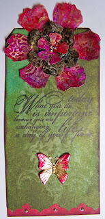
Over on Studio L3's blog a series of challenges has begun.  Every Monday Linda will post the page and name of a technique that is found in Tim Holtz's newest book Compendium of Curiosities and she invites anyone who would like to work their way through these techniques to give that weeks challenge a try and share their results.  This first challenge is Water Stamping and I made a tag.  Distress inks used for the background are forest moss and broken china.  Water stamping done with a stamp from the Fancy Flourish set.  The words (also Fancy Flourish set) are stamped with Archival Ink jet black.  The flowers at the top are cut using Tim's tattered floral die out of the plastic packaging that his texture fades embossing folders come in.  Color was added using alcohol inks.  They were embossed using the Damask folder.  Gold mixitive was gently rubbed over the top of the embossing using my finger.  The bottom of the tag is cut using the ornate on-the-edge die and then I added a piece of tag behind the cut area that was colored with both distress inks and adirondack ink so that the color would match the flower.  A gold butterfly charm with the edges of the wings alcohol inked.  Gold sticky-back pearls added to the center of the flower and along the bottom. 

Friday, June 18, 2010

Twinchies

If you don't know what a twinchie is... it is art on a 2 inch square.  Recently there was a twinchie swap on the EverythingWendyVecchi yahoo group that I participated in.  These are the twinchies I made for the swap...  we were allowed to go "outside" the 2 inch square so I did.  The base is grungeboard.  I used Distress inks for coloring and Archival inks for stamping.  All Studio 490 stamps.  Distress stickles on the flowers after coloring and stamping.  An Ideology snap and memo pin.


Sunday, June 6, 2010

A new stamp from Quietfire Design


Quietfire Design has two new calligraphy images... you can see them both here and they are both on sale until June 9th... info here. I'm using one on this little card that measures 4 1/4" square. All of QF's calligraphy rubber stamps are made from Suzanne's beautiful hand-penned calligraphy. The quote is stamped with Versafine ink and embossed with clear detail embossing powder onto a piece of background done with alcohol inks. My daughter and her friend were over a couple of months ago and we spent some time just playing with alcohol inks. I can't tell you exactly which colors I used on here but I can tell you that I made a lot of the speckles by putting alcohol ink on an old toothbrush and running my thumb over it. The big light areas were made by shaking on some blending solution, letting it sit a few seconds, and then blotting up the excess. After stamping the quote on it I cut it out with Spellbinders Labels Two die next to the largest size. It is mounted on a layer of black glossy cardstock cut with the largest size die. The next layer is a piece of white core cardstock embossed with a new Tim Holtz texture fade embossing folder - regal flourishes - and then I sanded over it with the Tim Holtz sanding tool. The base is again black glossy cardstock. The white dots are made using Ranger's new accent enamel... very cool stuff.

Mini Banner Swap

There was a mini banner swap on the EverythingWendyVecchi yahoo group last month that I participated in. The banners are 3 1/2" wide and 5" long. These are the 6 awesome banners I received back in the swap. They are from Lori, Debby, Kim, Kathy, Nancy, and Alexandra.

These are the banners I made for the swap.

And a closer look. I worked on Sticky-back canvas. I cut the canvas to size, stuck it to a piece of the new Tim Holtz paper, cut the paper and then frayed the side edges of the canvas. The background started with Wendy Vecchi's pigment and pearls technique - if I remember right, lol - I used Adirondack pigment ink terra cotta and gold perfect pearls. Then I stamped the leafy background image over it probably with terra cotta ink, next the words with Achival Ink jet black and then the floral border image with watermelon pigment ink. The bird is cut from grungeboard using Tim Holtz's alteration die and colored with distress ink with a little pigment snow cap dabbed along the belly area. The wing was stamped with a background image. A black gem for the eye. The flowers are cut from grungepaper also using an Alterations die, colored with distress inks and stamped with Archival inks, larger black gems for the centers.